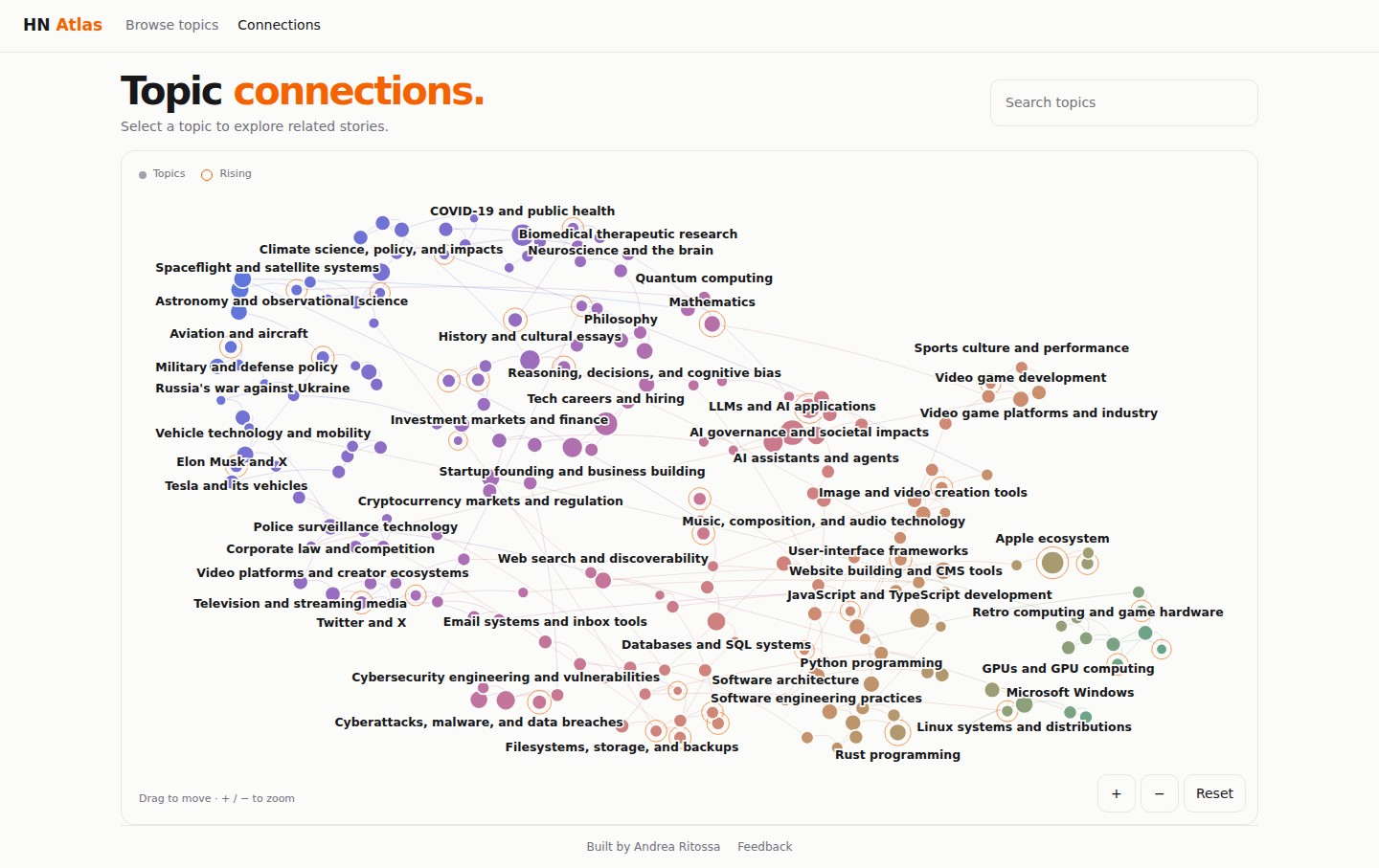
Hacker Atlas maps the 206 topics Hacker News talks about
A new site sorts Hacker News stories into 206 topics and tracks how many posts each one draws, which are rising and which are cooling. Its author says the tool covers 2024 to today.
Developer Andrea Ritossa presented Hacker Atlas in the Show HN section on 25 September: a site that groups Hacker News stories into 206 topics. In the author's words, it is a tool "to explore HN topics and how they change over time".
How it works
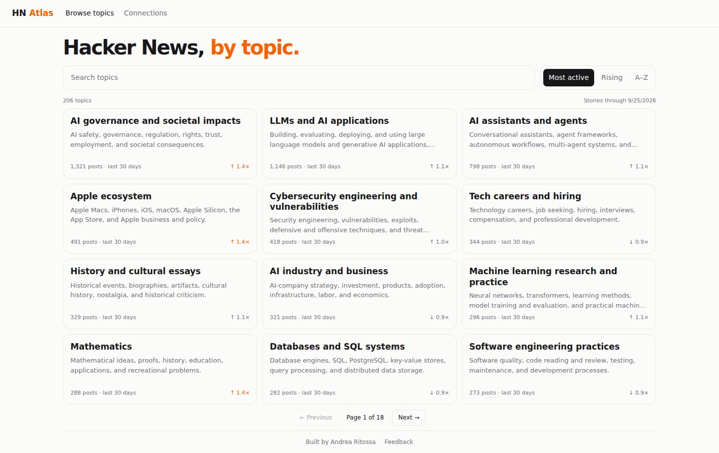
The front page carries a card for every topic: a short description, the number of posts in the last 30 days and a momentum figure. 1.4× means a topic is picking up speed, 0.9× that it has cooled. Counts are current through 25 September 2026, and the list sorts by activity, rising topics or alphabetically, with search by name.
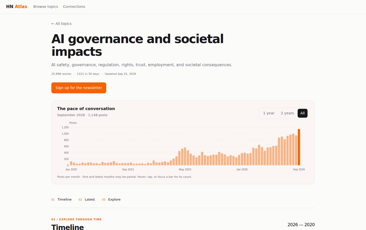
Each topic has its own page: total stories, the 30-day count, a "pace of conversation" monthly chart from January 2020 to September 2026 (first and latest months may be partial), newest and top story lists, and weekly or monthly digests. A separate Connections page draws a network of related topics.
What the numbers show
AI sits at the top of the board. The three busiest topics of the last 30 days are "AI governance and societal impacts" (1,321 posts, 1.4×), "LLMs and AI applications" (1,146) and "AI assistants and agents" (798). "LLMs and AI applications" is also the largest overall with 44,321 stories, ahead of the Apple ecosystem (32,507) and AI regulation (25,898).
Not everything is growing. "Tech careers and hiring" (344 posts in 30 days), "AI industry and business" (321) and "Databases and SQL systems" (282) sit below 1.0×, drawing fewer posts than in the previous period. Outside AI, the Apple ecosystem and mathematics rise fastest, at about 1.4×.
How it is built, and what readers said
Hacker Atlas is a static site: charts are drawn in the browser with the D3 library from data snapshots published as JSON files. The author says the data covers 2024 to today, although commenters noticed entries going back to 2020 and chart axes that start in January 2020.
Reaction on Hacker News was mostly positive, with readers praising the clean, mobile-friendly interface. The Connections graph drew the most enthusiasm, along with requests for zoom and full-archive search; others wanted all-time statistics instead of 30-day windows and continuous scrolling instead of pages. One reader argued the result is closer to an index than an atlas: a map should show the whole picture at a glance.
SiTech — AI-powered web development
We build fast, modern websites and bring AI into real business workflows. Have a project or a question? We'd love to help.