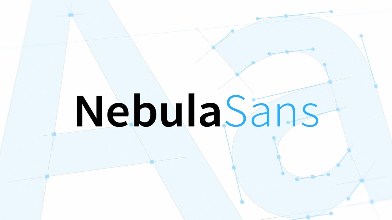
Nebula Sans: A Free Brand Typeface Built on Source Sans and Released Under the OFL
Nebula, the streaming service owned by independent creators, has released its own brand typeface: Nebula Sans builds on Adobe's Source Sans, replaces the commercial Whitney SSm and ships under the SIL Open Font License.
A streaming service that built its own typeface
Nebula, the subscription streaming service owned by independent creators, has a new brand typeface. Nebula Sans is a humanist sans-serif with a neutral aesthetic, designed for legibility on screen and in print, and built on Source Sans — the open typeface Paul D. Hunt made for Adobe Fonts. The team describes it as a drop-in alternative to Whitney SSm, the commercial family Nebula used before, and it is available to anyone under the SIL Open Font License.
Why the company made its own font
Nebula gives three reasons. The first is personalization: an in-house font can be tuned to the company's own preferences. The second is features, since advanced typographic settings can be tailored to real interface use cases. The third is sustainability, because the cost of licensing commercial typefaces rises as a company grows. Source Sans was chosen as the foundation because it shares key characteristics with Whitney SSm: both were designed to bridge American gothic and European humanist type styles with a strong emphasis on readability. Most of the work went into adapting Source Sans metrics to match Whitney's, since Source Sans is smaller and narrower by default.
Punctuation, alternates and a star-shaped asterisk
Whitney's default punctuation was, by the team's own taste, too straight, so Nebula Sans takes the curly glyphs from Source Sans. Stylistic alternates carried over as well, with defaults aligned to Whitney: a single-storey "a" (ss01), an open "g" (ss02) and a tailed "l" (ss03). The asterisk got the most attention — in typography the mark was named after a star, so the designers redrew it as a five-pointed, upside-down star that echoes the Nebula logo. Nebula Sans also includes tabular figures, which Whitney SSm lacked; monospaced numerals keep the digits in the video player's timestamp from jumping around as the value changes.
Availability and the documentary
The family ships in two styles, upright and italic, across six weights: Light, Book, Medium, Semibold, Bold and Black. The current download is version 1.010, released under the SIL Open Font License, with the font files and licence terms published on the project's site. Nebula also produced a short documentary on the making of the typeface, written and directed by David Friedman.
SiTech — AI-powered web development
We build fast, modern websites and bring AI into real business workflows. Have a project or a question? We'd love to help.