10 Tells of a Slop UI: How to Spot an AI-Generated Interface
A developer's blog post lists ten giveaways of an interface assembled by an AI model: gradients, meaningless colour, pulsing status badges, generic typography and unearned hype copy.
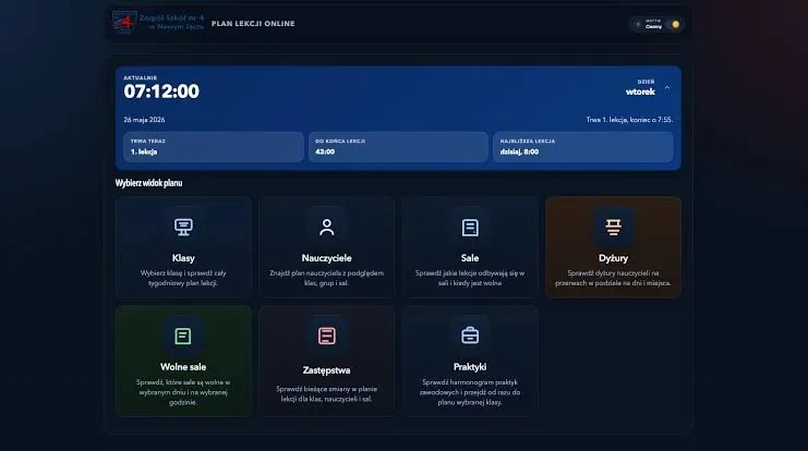
A college app came back from a "minor UI improvements" update as, in one developer's view, the most slop-coded interface he had ever used. His blog post, published under the handle hereticpleb, lists ten tells that give AI-generated design away.
What slop UI means
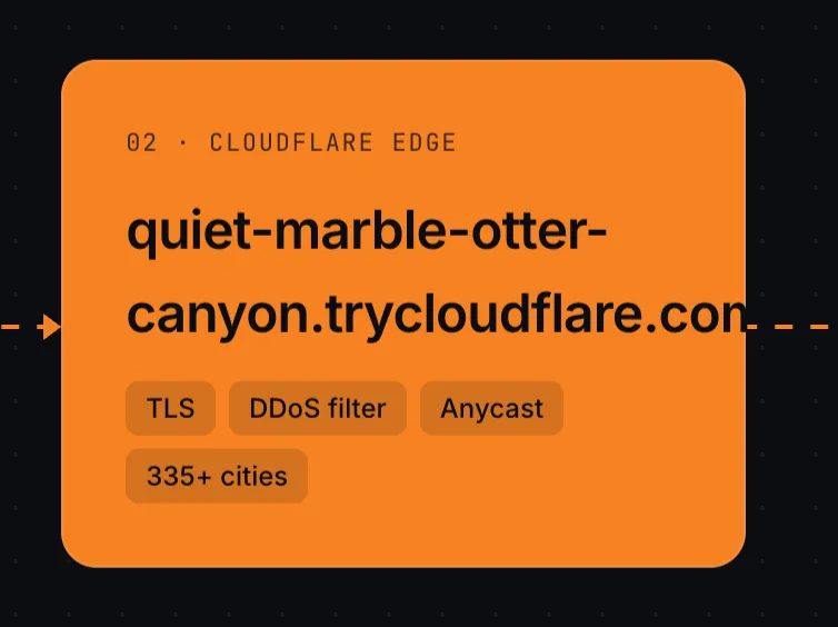
He defines slop UI as the interface a model cooks up that looks off, sits where it should not, serves no purpose, or is simply too generic to feel designed. It shows up most in vibe-coded products built without a vision, and in most cases leaves an app looking cheap. Among his examples is a recently published Cloudflare website, which he calls slop-coded, along with the wider family of dashboards that, as he puts it, you recognise the moment you see them.
The visual tells
Gradients come first: on buttons, in backgrounds, wherever one fits. Purple gets a special mention as the favourite of what he calls slop cannons. Next is colour with no meaning, screens of clashing hues that ignore the usual 70-30-10 split between dominant, secondary and accent shades. Then pulsing status badges: in his college app one marks the digital ID as "active", although it is never inactive, since an inactive card simply logs the user out.
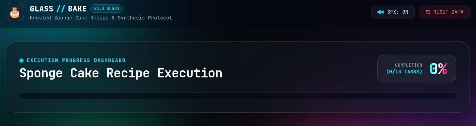
Further down the list sit the small rounded cards he calls fingernails, which appear in almost every vibecoded layout; emoji scattered across headings and buttons; and elements that slip out of alignment whenever they are not inside a box. Typography is its own tell: these sites reach for Inter, or JetBrains Mono once code is involved, and dress anything technical in decorative slashes.
Copy, glassmorphism and hype
Two entries are textual. Working from a chat context, the model pads a page with details nobody asked for: the author's own blog once gained the line "Built with Hugo. Written from Neovim", and README files collect similar notes. Glassmorphism is the language it reaches for by default, he writes, while the handful of brutalist attempts all end up looking the same. The copy then lives off a fixed set of words: elevate, seamless, next-generation, supercharge, unleash, empower.
Effort, not the tools
The author is explicit that he is not against vibe coding: the post itself is published on a site built that way. His complaint concerns effort. Interfaces assembled at speed are easy to spot because nothing inside them was decided deliberately.
SiTech — AI-powered web development
We build fast, modern websites and bring AI into real business workflows. Have a project or a question? We'd love to help.