AI-generated posters don't have to be horrible: a blogger's style experiment
Tired of identical machine-made event flyers, a blogger asked ChatGPT for fifteen deliberate design styles and argues the repetitive AI poster look is a prompting problem, not a limit of the models.
John Hartnup's blog post on AI-generated event posters has found a second audience months after publication, arguing that the repetitive look of machine-made flyers is a prompting problem rather than an unavoidable limit of image models.
The identikit poster problem
The post opens with a now-famous Facebook collage of village fayre posters and an article on the subject from the Independent, plus one spotted in the wild for the Leamington Beer Festival 2026. The complaint is not that the results are bad - they are, he writes, OK - but that once you have seen that style twenty times it starts to irritate from sheer repetition. Knowing ChatGPT was capable of broader variety, he set out to prove it.
From default template to Bauhaus
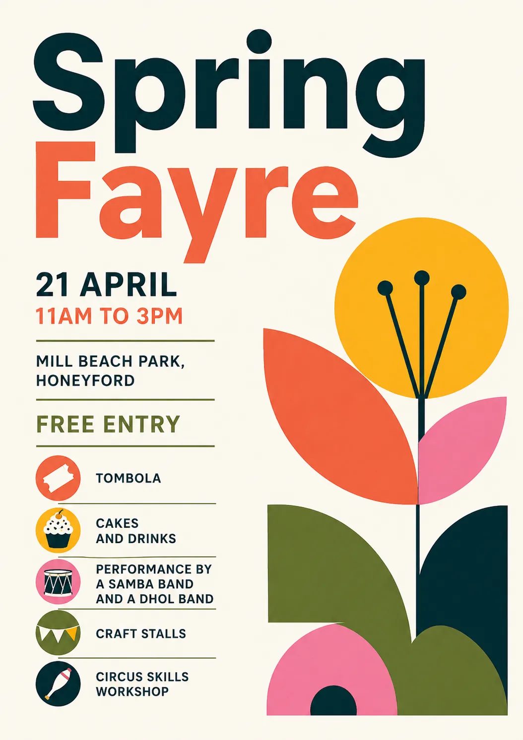
He gave the model invented event details: a spring fayre on 21 April, 11am to 3pm, at Mill Beach Park, Honeyford, with free entry, a tombola, cakes and drinks, a samba band and a dhol band, craft stalls and a circus skills workshop. He asked for a clean, unfussy, bright layout with a bold spring-themed graphic, ruling out pastel, airbrush and oil-painting styles and images of people.
The first attempt returned the default craft fayre template he wanted to avoid. A second prompt - make another one in a completely different design aesthetic of your choice, and treat the current one as a what-not-to-do - produced a Bauhaus-influenced geometric modernist poster. Asked to name the style, ChatGPT described Bauhaus and modernist poster design with geometric minimalism and Swiss Style influence, and noted that local posters usually default to bunting, hand-drawn florals, pastel palettes and craft-fair aesthetics.
Fifteen styles, one prompt each
Rather than dredging names from memory, Hartnup asked for a menu. The reply grouped fifteen options: Bauhaus, Swiss Style and contemporary editorial; risograph, Matisse-inspired cut paper and modernised botanical illustration; brutalist, 90s rave flyer and Memphis design; Japanese minimal, monochrome with one accent and wayfinding signage; plus icon systems, letterpress and indie festival posters.
He then generated posters in letterpress, Japanese minimal, Memphis, Designers Republic-inspired, child's poster-paint finished by a professional typographer, 1980 punk fanzine, 90s drum and bass flyer with early 3D imagery, and 1940s cubist exhibition styles.
What the experiment shows
One trap is worth noting: midway through, a poster acquired extra text that stayed in the chat context and reappeared in later generations. Asking for the style up front avoids picking up such trappings.
The conclusion is modest. Sharp-eyed viewers will still recognise these as AI-generated, but they are distinctive and, in the author's words, not ugly. He also points to a further step - asking for HTML, PNG or PDF output, where the text is real text and layers are real layers, so fonts and layout can be edited afterwards. His catalogue of one hundred poster styles collects the prompts and example images.
SiTech — AI-powered web development
We build fast, modern websites and bring AI into real business workflows. Have a project or a question? We'd love to help.