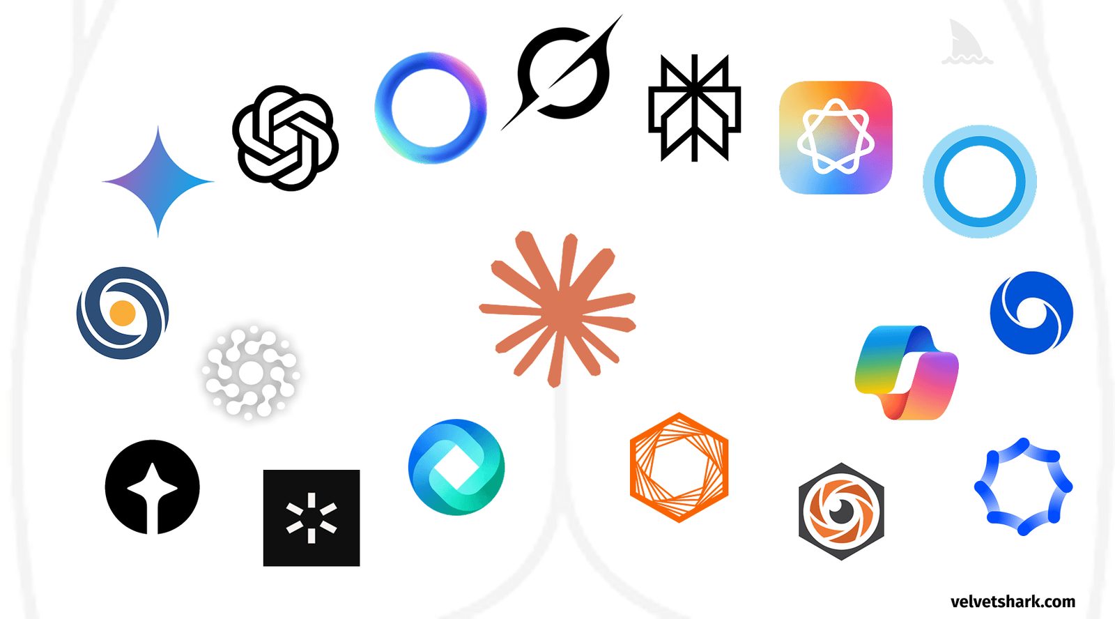
Why AI company logos all look alike: the circular branding trend under scrutiny
A widely read analysis by VelvetShark argues that AI branding has converged on one formula — circles, gradients and a central opening — and asks what that sameness says about the industry.
A recognisable pattern
AI company branding has converged on a formula that is hard to miss, according to an analysis published by VelvetShark. The author lists four recurring traits: a circular shape, often with a gradient; a central opening or focal point; elements radiating from the centre; and soft, organic curves. The article's title spells out the anatomical comparison that description invites.
The observation itself is not new. FastCompany noticed the same tendency in 2023 and published a piece under the deliberately neutral headline “The AI boom is creating a new logo trend: the swirling hexagon”, avoiding any anatomical reference. The VelvetShark article, first published in April 2025 and updated in July 2026, pushes the argument further.
From text marks to circles
OpenAI's original logo was a simple text-based mark. The redesign replaced it with a circle, a subtle gradient and a central void. The company's own brand guidelines describe the “Blossom” logo as capturing “the dynamic intersection between humanity and technology”, adding that circles convey “the fluidity and warmth of human-centered thinking” while right angles introduce “precision and structure”.
Across the largest AI labs, almost every logo uses a circular or snowflake-like form with an opening in the middle. Only DeepSeek and Midjourney sit outside the pattern — and, as the author notes, both names are sea-related.
Why it keeps happening
The article offers several explanations. Circles suggest wholeness, completion and infinity — concepts that map onto the promises made for AI — and they read as friendly rather than threatening, which matters for a product that may replace jobs. Pareidolia, the human tendency to find familiar shapes in random forms, plays a part, as does the copycat effect: once a few major players adopted the look, it became the shorthand for seriousness in AI.
Design by committee is another factor. No single person proposes such a logo, but when the feedback of many stakeholders is averaged out, the safest and least offensive option tends to win.
Conformity, then and now
The piece places the trend in a longer sequence of tech design waves: glossy 3D icons in the late 1990s and 2000s, skeuomorphism between 2010 and 2013, flat design from 2013 to 2018, neomorphism from 2018 to 2022, and the current era of circular gradients.
The tone is deliberately humorous, but the point about the pressure to look legitimate by conforming is serious. The author suggests sharper angles, more creative use of negative space and less radial symmetry, and cites brands that avoided the cliché: Slack's hashtag-inspired mark, Netflix's “N”, Stripe's parallel lines and Twitch's purple. The challenge for the next generation of AI companies, he writes, is signalling innovation without repeating the same shape.
SiTech — AI-powered web development
We build fast, modern websites and bring AI into real business workflows. Have a project or a question? We'd love to help.